Dark Mode Color Palette Design Principles
Patrick Bushe
April 18, 2025 · 5 min read
A dark theme isn't the light theme with colors flipped. It needs its own palette, built on different rules, because colors behave differently against dark backgrounds. These principles, many drawn from Google's Material Design guidance, give you a palette that's comfortable and consistent.
1. Build layers of dark gray
Use a dark gray, not pure black, as the base. Material Design uses #121212. Then define slightly lighter grays for surfaces that sit above it: cards, menus, dialogs. Three to five steps are usually enough.
2. Show elevation with lightness, not shadows
Shadows barely show on dark backgrounds. Instead, the higher a surface sits, the lighter its gray. A dialog is lighter than a card, which is lighter than the page.
3. Use three levels of text
Instead of many grays, define text by emphasis. Material Design suggests white at about:
- 87% opacity for high-emphasis text such as headings and body copy.
- 60% for medium emphasis, such as secondary labels.
- 38% for disabled text.
Check that the medium level still meets contrast requirements for anything people need to read.
4. Soften your brand colors
Saturated colors that work on white can vibrate or glow on dark gray. Use lighter, less saturated versions of your brand and accent colors in dark mode, often a tint or two lighter than in light mode.
5. Define colors by role
Name colors by what they do, such as background, surface, text-primary, accent, error, and give each role a light and a dark value. Components use the roles, so switching themes swaps every value at once. See design tokens.
6. Rethink status and chart colors
- Red, green and amber need dark-mode versions with enough contrast.
- Don't rely on color alone; add icons or labels. See dark mode for colorblind users.
- Test chart lines and fills against the dark background.
7. Handle images and logos
Provide light versions of dark logos, and consider dimming very bright images slightly in dark mode.
8. Test every pair
Check contrast for each text and background pair with the contrast checker. See making dark mode accessible.
Study good dark themes
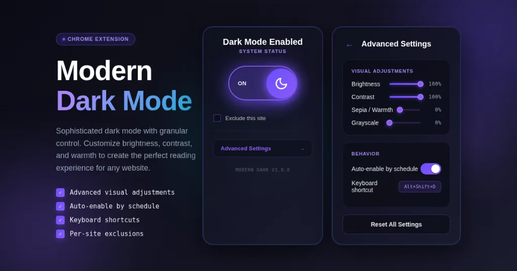
Color Palette Extractor lists the most-used colors on any page, so you can see how well-made dark sites layer their grays and accents. For sites with no dark theme, Modern Dark Mode darkens pages with brightness and contrast controls while keeping hues and images close to their originals.