Concept Medical clinic · Website
Kinfield Family Medicine
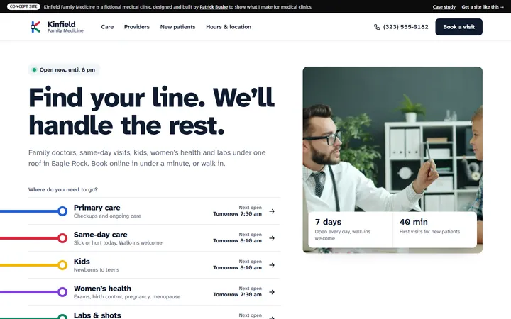
A family clinic site where every kind of care has its own colored line, and booking takes under a minute.
Concept Ashby & Rourke · Law firm · Los Angeles
An injury firm site built on freeway signs, with a four-step free case review that a lawyer reads.
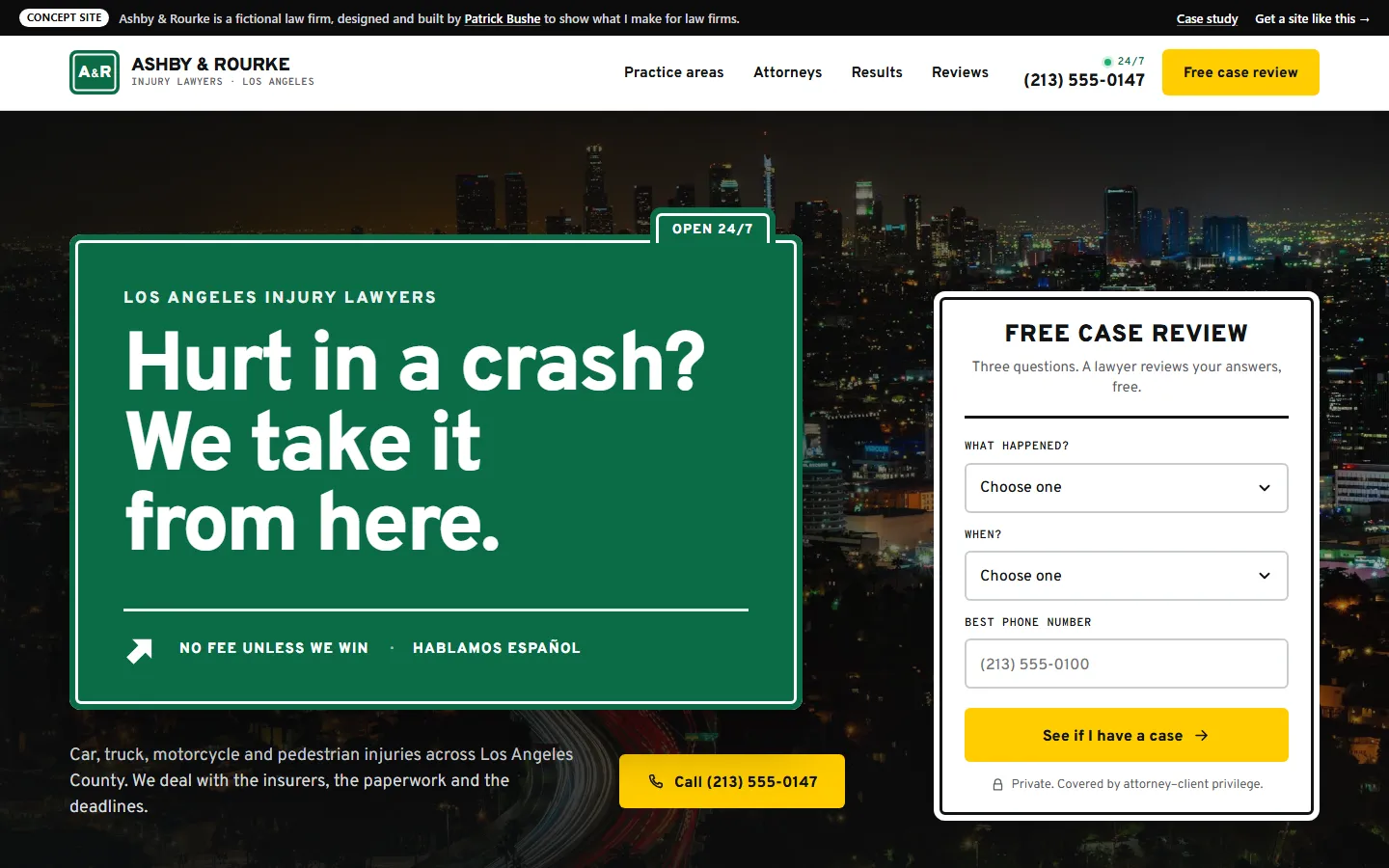
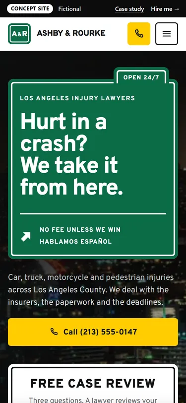
Ashby & Rourke is a made-up personal injury firm in Los Angeles: four lawyers who handle crashes on L.A. roads, falls and wrongful death cases.
People find a firm like this on their phone, often days after a crash, hurting and unsure whether they even have a case. They need to see fast what the firm handles, believe that a real lawyer will call back, and start without a long form.
The idea
Every driver in L.A. reads the green guide signs without thinking, and most of this firm’s clients were hurt on those roads. The site borrows the whole sign system: Caltrans green panels with a white inset border, Overpass type (drawn from the Highway Gothic sign alphabet), practice areas as exit signs, mile markers for the case timeline, and the yellow roadside call box for the phone number.
Each kind of case is an exit sign with its own number, so “Pick your exit” does the job of a services menu. Every exit opens a page with what the firm handles, common questions and the other exits.
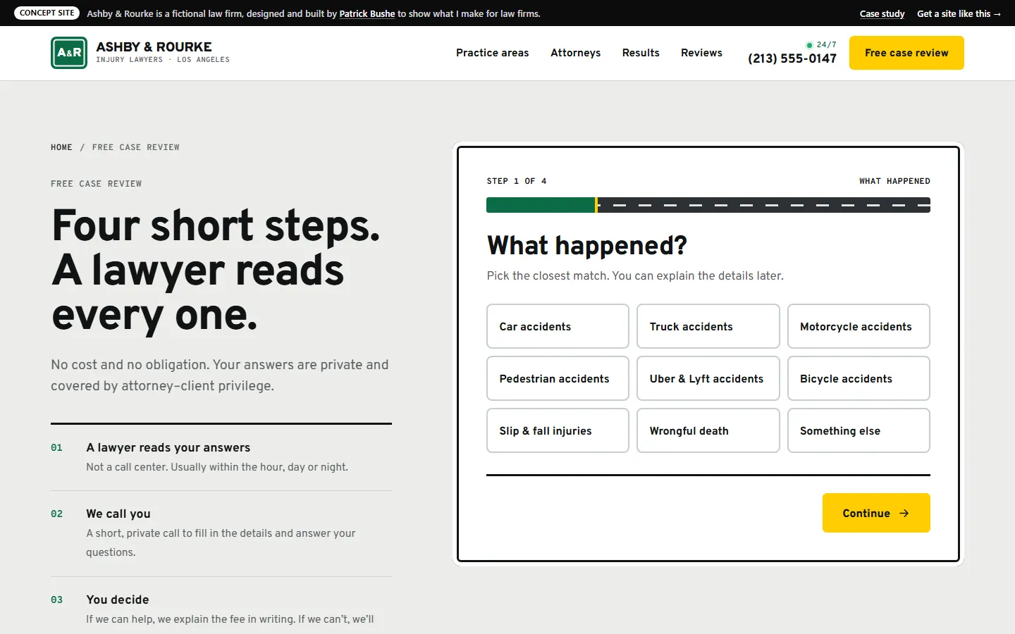
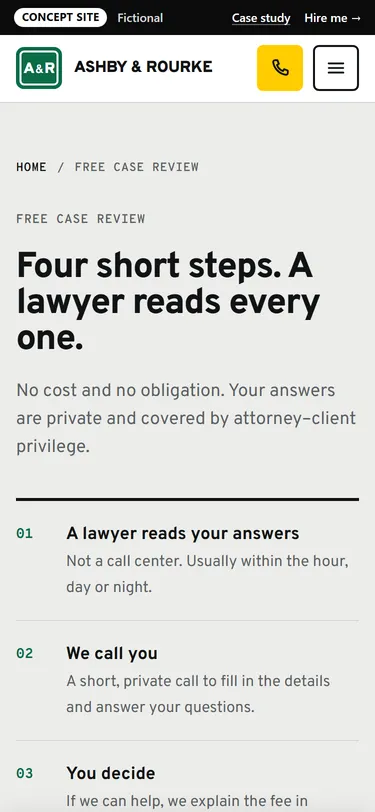
A three-question starter on the home page hands its answers to the full case review, so nobody faces a long form first. The review itself is four short steps.
“Just crashed? Do these six things” and a timeline from the crash to the check answer the questions people have before they’re ready to call.
Law firm sites lean on settlement numbers and reviews. This one shows where they go, but every result and review is labeled Sample, because the firm doesn’t exist.
Everything works in the browser. Forms and checkout don’t send anything.
Want one like it?
Your site gets its own idea, the way this one does, built around your business and your customers. You get one fixed price after a free call, and you work with me directly from the first sketch to launch.
Get your fixed quote
You get a fixed-scope quote within 48 hours. No sales call needed.
Concept Medical clinic · Website
A family clinic site where every kind of care has its own colored line, and booking takes under a minute.
Concept Contractor · Website
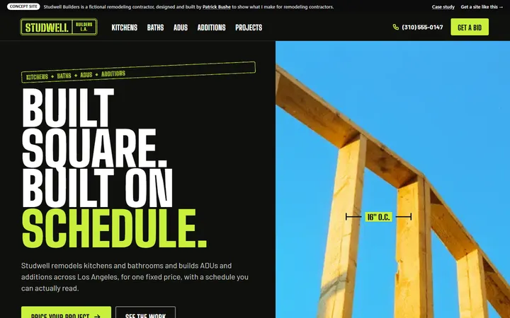
A remodeler’s site with a live rough estimate and the week-by-week schedule every client gets.
Concept Real estate · Website
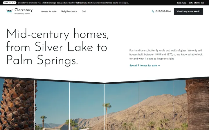
A brokerage site for mid-century homes, with filters, a payment calculator and a home value estimate.